
Travel Software: 8 Reasons Mobile Responsiveness Matters

The Importance of Mobile Responsiveness in Travel Software
By 2025, mobile devices are expected to account for over 75% of global travel bookings, with most users initiating their journey research and purchase process on smartphones. As travel becomes more digital and competitive, having mobile-responsive travel software is no longer optional—it’s foundational.
Mobile responsiveness isn’t just about design aesthetics. It impacts:
- Your visibility on Google
- User engagement and loyalty
- Conversion rates on bookings
- Seamless operations across the travel agency staff
In this deep dive, we’ll explore:
- How responsive travel software drives real business growth
- What “mobile responsiveness” technically means
- Common design & performance pitfalls to avoid
- Why IV Trip’s mobile-first framework is a market leader in Bangladesh
Understanding Mobile Responsive Web Design for Travel Software
What Is Mobile Responsive Web Design?
Mobile responsive web design allows a website or app’s layout, content, and media to adapt fluidly to any screen size. By using fluid grids, flexible images, and media queries, responsive design ensures consistency and ease of use, whether your customer is on a phone, tablet, or desktop. This approach means one codebase can serve all devices, making it more efficient to manage.
Responsive vs. Adaptive Design
While both aim to provide a good user experience on different devices, their methods differ.
| Feature | Responsive Web Design | Adaptive Web Design |
| Layout | Single, flexible layout that adjusts
dynamically. |
Multiple fixed layouts triggered by
device breakpoints. |
| Flexibility | Highly flexible; adapts to any
screen size. |
Less flexible; only adapts to
predefined screen sizes. |
| Development | One codebase for all devices; easier
maintenance. |
Multiple codebases; more
labor-intensive to maintain. |
| SEO | Generally better for SEO; Google
favors a single URL. |
Can be less SEO-friendly due to
multiple URLs. |
| Load Speed | Can be slightly slower if not
optimized for mobile. |
Often faster as it only loads assets
for the specific device. |
| Best Use Case | Ideal for new websites and scalable
applications. |
Better for retrofitting an existing
website or when a highly specific design is needed for a few devices. |
Most travel software platforms benefit from a responsive setup due to its better SEO and easier maintenance.
What Makes Travel Software Truly Mobile-Responsive?
| Feature | What It Does | Why It Matters |
| Fluid Grids | Adapts the layout based on screen size | Maintains structure across mobile/tablet/desktop |
| Media Queries | Applies different styles based on device resolution | Enables custom mobile styles |
| Flexible Images | Resizes images for smaller screens | Reduces load time |
| Viewport Meta Tags | Sets screen width for mobile devices | Prevents layout breaking |
| Touch-Friendly Elements | Makes buttons and menus tappable | Reduces friction in mobile booking |
✅ Travel software must also avoid:
- Horizontal scrolling
- Overlapping content
- Form fields that zoom uncontrollably
- Desktop-only components like hover states
Best Reasons Mobile Responsiveness Is Critical in Travel Software
-
Boosts Booking Conversions
Users will quickly abandon clunky mobile booking flows. A mobile-responsive design simplifies navigation, reduces form friction, and optimizes CTA placement, directly leading to higher conversion rates. A case study from a travel company showed a 26% increase in conversions simply by optimizing a long, multi-column form into a single-column, mobile-friendly one.
-
Enhances SEO & Page Experience Signals
Google’s Page Experience algorithm ranks mobile-friendly sites higher, and its mobile-first indexing means the mobile version of your site is the one that gets indexed first. Meeting Core Web Vitals like LCP (Largest Contentful Paint) and CLS (Cumulative Layout Shift) is easier with a responsive design that is built for speed.
-
Consistent Cross‑Device Experience
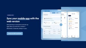
A responsive design ensures users enjoy the same, high-quality experience regardless of the device they’re using. IV Trip’s travel software, for example, syncs itineraries and bookings across mobile and web seamlessly, enabling continuity whether a customer books on a phone or a desktop.
-
Faster Load Times & Better UX
When paired with performance optimization techniques like image compression, minimized code, and lazy loading, mobile responsiveness dramatically speeds up page loading. Studies show that 47% of users expect a page to load in under 2 seconds on mobile; anything slower will likely increase your bounce rate.
-
Lower Maintenance Costs
Instead of maintaining separate platforms for mobile and desktop, responsive design means you only have one codebase to manage. This simplifies updates, reduces the chances of errors, and significantly lowers development and maintenance overhead.
-
Stronger Brand Perception
A responsive travel software platform looks professional and modern, boosting your brand’s credibility. Agencies that use a platform like IV Trip report higher customer satisfaction due to its “mobile-first design” and ease of use on smartphones.
-
Improved Social Media & Affiliate Reach
When a user clicks a link from Instagram, Facebook, or an affiliate banner, they expect it to land on a fast-loading, user-friendly page. Responsive design ensures these links lead to a positive experience, helping you convert visitors from social channels or affiliate partners more effectively.
-
Future‑Proofing & Scalability
As new devices and screen sizes continue to emerge, a responsive design will adapt automatically. This approach ensures your travel software stays relevant and scalable as technology evolves, from voice search optimization to new mobile operating systems.
Best Practices for Mobile Responsive Travel Software
- Optimize Page Speed & Core Web Vitals: Compress and lazy-load images, minify JavaScript and CSS, and avoid intrusive pop-ups that hurt user experience and SEO.
- Simplify Mobile Navigation & Booking Flow: Use hamburger menus and sticky CTAs, add progress indicators for multi-step checkouts, and offer auto-complete to reduce user taps.
- Design for Thumb Zones & Accessibility: Place crucial buttons within easy thumb reach and ensure text and form elements are large enough for touch-based interaction.
- Use Fluid Grids & Flexible Media: Ensure all images are resized for mobile performance and use formats like SVGs to maintain quality without sacrificing speed.
- Conduct Mobile‑Only User Testing: Use A/B testing and heat maps to track user behavior and identify pain points on mobile. Collect real feedback on the mobile user experience to continuously improve.
How IV Trip Ensures Mobile Responsiveness in Travel Software
IV Trip was engineered from the ground up with a mobile-first design philosophy, meaning every feature is optimized for smartphones and tablets before being scaled up to larger screens. This ensures that users—whether customers booking a trip or agents managing itineraries—receive a fast, seamless experience no matter what device they’re using.
Blazing-Fast Mobile Performance
At the core of IV Trip’s mobile responsiveness is its focus on speed and interactivity. The platform is optimized to exceed Google’s Core Web Vitals standards, including:
- Largest Contentful Paint (LCP): Ensuring main content loads quickly, usually under 2.5 seconds.
- First Input Delay (FID): Making interfaces reactive and reducing lag on taps and scrolls.
- Cumulative Layout Shift (CLS): Preventing layout jumps on smaller screens.
These improvements don’t just enhance user experience—they directly impact SEO rankings and conversion rates, particularly for mobile-first users.
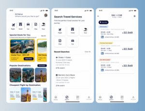
Fluid, Modular UI Across Every Feature
Unlike legacy travel systems that struggle on small screens, IV Trip uses a modular, responsive UI framework. Whether users are:
- Browsing packages
- Filling out multi-step booking forms
- Managing client communications
Viewing analytics or financial reports
- The entire interface adapts fluidly to fit screen dimensions. Buttons are optimized for touch, menus simplify into mobile drawers, and inputs are designed for thumb accessibility.
Cross-Device Experience
IV Trip offers a cloud-synced platform accessible via browsers and apps across all devices. This allows:
- Customers are to start a booking on desktop and complete it on mobile.
- Agents to check itineraries or respond to customer inquiries while on the move
- Admins to monitor bookings, invoices, or supplier updates in real-time from any screen.
This device-agnostic continuity is key to modern travel workflows.
Localized Optimization for Bangladesh & Emerging Markets
Mobile users in regions like Bangladesh often face challenges such as low bandwidth, limited device storage, and regional language needs. IV Trip addresses these by:
- Integrating Bengali language support in UI and customer touchpoints
- Supporting local mobile payment gateways such as bKash and Nagad
- Ensuring minimal file sizes, fast CDN-delivery, and optimized caching for low-bandwidth connections
- Providing mobile-friendly invoice and voucher PDFs that open cleanly on small screens
By combining performance engineering with localized UX, IV Trip enables travel agencies to serve their clients better, even in rural or infrastructure-constrained environments.
FAQs: Mobile Responsiveness in Travel Software
What is travel software?
Travel software is a digital system designed for travel agencies to manage various operational aspects, including bookings, payments, itineraries, and customer relationship management (CRM).
Why is mobile responsiveness important in travel software?
Mobile responsiveness is crucial because the majority of users now browse and book travel on their mobile devices. A responsive design ensures a seamless and positive user experience (UX), which in turn leads to higher booking conversions and better search engine optimization (SEO).
How does responsive design affect SEO?
Responsive design significantly impacts SEO because Google uses mobile-first indexing. This means the search engine primarily uses the mobile version of a website to determine its ranking. Sites that are fast, interactive, and visually stable on mobile—metrics measured by Core Web Vitals—are favored in search results.
How can I test if my travel software is mobile-responsive?
To test your software’s mobile responsiveness, you can use Google’s free tools like the Mobile-Friendly Test and PageSpeed Insights. For more comprehensive testing, professional tools like BrowserStack or direct testing on a variety of real mobile devices are recommended to check for real-world performance issues.
Can responsive design reduce development costs?
Yes, it can. Maintaining a single, responsive website codebase is generally more cost-effective than developing and managing separate websites or apps for desktop and mobile devices. This streamlined approach reduces development time, simplifies updates, and lowers overall maintenance costs.
What are Core Web Vitals?
Core Web Vitals are a set of specific metrics that Google uses to measure user experience. They consist of three key metrics: Largest Contentful Paint (LCP), which measures loading performance; First Input Delay (FID), which measures interactivity; and Cumulative Layout Shift (CLS), which measures visual stability. These are crucial for both SEO and a positive UX.
How does IV Trip support mobile responsiveness?
IV Trip is built with a mobile-first approach, ensuring its platform loads quickly and syncs seamlessly across all devices. It is specifically optimized for local users, offering features such as support for mobile payment gateways and a localized user interface to cater to the specific needs of each market.
What is the best mobile responsive travel agency software in Bangladesh?
For travel agencies in Bangladesh looking for a responsive and mobile-friendly software solution, IV Trip is an excellent choice. It is specifically designed with the local market in mind, offering a seamless user experience, fast performance on mobile devices, and a suite of tools that are optimized for both agents and customers.
Should travel software support adaptive design instead?
While adaptive design can sometimes result in faster page loads for specific devices, responsive design is generally preferred for modern travel software. It offers better scalability, improved SEO (since it uses a single URL), and easier maintenance with one flexible codebase that adapts to a wider range of screen sizes.
How do image and media choices impact mobile speed?
Heavy or unoptimized images and media are a primary cause of slow load times on mobile. To improve performance, you should compress images, use modern formats like WebP, implement lazy loading so images only load when they’re visible, and use Scalable Vector Graphics (SVGs) for graphics whenever possible.
What user testing is best for mobile UX?
For effective mobile user experience (UX) testing, a combination of methods is best. This includes running A/B tests to compare different design elements, using heatmap analysis to see where users tap and scroll, and conducting usability tests with real users to get direct feedback on the booking flow and other key features.
In today’s fast-evolving digital travel landscape, mobile responsiveness is no longer a feature—it’s a strategic requirement. From customer-facing booking flows to backend dashboards for agents, your travel software must work flawlessly across every screen size. Agencies that fail to prioritize mobile optimization risk losing visibility, trust, and revenue.
Platforms like IV Trip exemplify how mobile-first design drives real business outcomes—from improved bookings to better SEO to happier clients.
Ready to optimize your travel agency’s mobile experience?
✅ Read our blog on Page Experience & SEO
✅ Subscribe to the IV Trip blog for expert travel tech updates
✅ Explore booking engine features